Four pitfalls of spatiotemporal data analysis and how to avoid them
Recently, I got very excited about the possibility of moving my data analysis code from R to DuckDB, and I gave a workshop about this approach at SciCar23 and wrote a blog post about this here.
DuckDB makes it easy to load and analyze millions of data points measured at thousands of weather stations, in fact, it almost makes it too easy. In the workshop, I used a query that showed how to compute aggregates like the average temperature over the entire datasets:
FROM weather SELECT MEAN(TMK) AS "avg. temperature";This resulted in a total average of 8.53 degrees. Lucky for me, nobody in the workshop audience called out the many problems with this query. Can you see them?
Weather station measurements are so-called “spatiotemporal” data, meaning each data point is associated with a point in time and space. And you can’t just aggregate spatiotemporal measurements without risking falling into one of many traps.
Pitfall #1: Temporal skewing
Not sure if “skewing” is the correct term here, but what I mean is that you get a problem, when you’re aggregating time series data that is not distributed evenly over time. To understand this, let’s take a look at the number of measurements per year in the DWD weather dataset:
As you see, the majority of measurements have been taken since the 1950s, so if we would just take the mean over all of them, the years before the 1950s would be highly “underrepresented”.
Fortunately, there’s a relatively easy way to adjust for this by first computing annual means and then taking the mean of the annual means.
FROM (
    FROM weather
    SELECT year(date), MEAN(TMK) annual_mean
    GROUP BY year(date)
) SELECT MEAN(annual_mean)
The new mean is 7.67, almost a degree cooler than the 8.56 we calculated before. Here’s what the annual means look like, compared to the two means we’ve computed so far:
If you look closely at the annual temperature plot above, you may have noticed that 2023 showed a steep temperature increase. Now, while 2023 is indeed highly likely to become the warmest year on record there is another problem in our analysis.
Pitfall #2: Incomplete time intervals
We’ve taken means of annual temperatures, but the data for 2023 is not complete. Half of November and the entire of December are still missing in the dataset shown above, resulting in a higher average temperature for this year.
And since temperature data is highly seasonal, we shouldn’t aggregate incomplete years! This can also happen if weather stations stop reporting data.
One way1 to improve our query would be to first compute mean monthly temperatures, while skipping months where we don’t have enough data points (in the example query below, we say that 21 measurements per month is enough). Then we compute the annual means from the monthly means, but we skip years for which we don’t have averages for all 12 months:
FROM (
    FROM (
        FROM weather
        SELECT
            year(date) "year",
            month(date) "month",
            MEAN(TMK) monthly_mean
        GROUP BY year(date), month(date) HAVING COUNT(*) > 20
    )
    SELECT "year", MEAN(monthly_mean) annual_mean
    GROUP BY "year" HAVING COUNT(*) = 12
)
SELECT MEAN(annual_mean)
With this third version, the total average temperature has now further dropped to 7.62°C.
So far, the temporal issues have been relatively easy to fix, just using SQL. But now we’re taking a look at a much harder problem.
Pitfall #3: Unevenly distributed spatial measurements
Our simple query has another big problem: temperature varies not only over time, but has also a strong regional variance. So we can’t just average the measurements of unevenly or irregularly distributed stations. To illustrate this, let’s take a look at two imaginary distributions of weather stations in Germany:

Note how in the left version we have a higher density of stations in the North while in the right version, there’s a higher station density in the South. That means unless we account for the regional station density, we’d likely end up with different averages.
To test how much of a difference this can mean, let’s take a look at the mean daily temperatures for December 16, 2023, as it was measured at 0 weather stations:
const northernStates = [
    'Niedersachsen',
    'Schleswig-Holstein',
    'Hamburg',
    'Bremen',
    'Mecklenburg-Vorpommern'
];
weatherData = [
    ...weatherData,
    ...(weatherData.filter(d => northernStates.includes(d.state)))
];
Alright, so how exactly can we do this? If only there was a way to turn our unevenly distributed measurements into an evenly distributed measurement. The latter are called “grids” in GIS, but since we can’t just move a weather station, we have to come up with a way to “guess” (or rather interpolate) the values for each grid position.
Now, there are several ways to interpolate grids from irregular stations. For this blog post, I’m just going to go with a simple one called “nearest neighbor”. For each grid position, we’re just taking the value from whatever weather station is closest.
(In case you’re wondering how you can interpolate from irregular stations to a regular grid, check out the documentation of gdal_grid and also this interesting tutorial from rspatial.org.)
Pitfall #4: Choosing the wrong interpolation method
In the previous section, I talked about why it’s important to interpolate from irregularly positioned data points to a regular grid before computing averages. But I didn’t want to end this blog post without showing you how actual professional data scientists are computing these grids to come up with regional statistics.
The German Weather Service (DWD), which is running most of the weather stations, publishes ready-to-use temperature grids for each month/season/year, so let’s take a look at them. Here’s the grid for mean temperatures in September 2023:
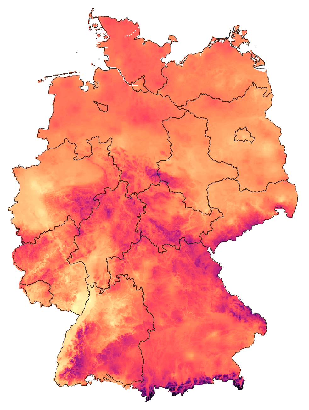
The first thing that is striking is the level of detail in this grid, which is still based on just a few hundred weather stations in Germany! Curious how the DWD came up with this result I checked out the dataset documentation to find this:
The gridding method is based on height regression and Inverse Distance Weight (IDW), see Müller-Westermeier, 19952.
Inverse Distance Weight is an alternative interpolation method to the Nearest Neighbor method we used above. But what is up with this “height regression”? To understand this, let’s look at a simple example of interpolating between just two stations:
If we’re just looking at these stations from above, there’s not much we can see that would help us to improve the interpolation along the line. But it’s worth keeping in mind that the world isn’t two-, but three-dimensional, and once we plot the stations along their (imaginary) altitude, the idea gets clear:
To interpolate temperature between A and B, we can take into account that temperature usually changes depending on the altitude. We can confirm this by plotting all the weather station temperatures on December 16 against the station altitudes:
As we can see, the higher stations are located, the cooler the temperature tends to get.
Now here’s the brief rundown of the DWD interpolation process:
- The first step is to take the temperatures measured at each station and to use a simple linear regression to project them onto a reference altitude.
- Then the projected temperatures are interpolated “horizontally” using the Inverse Distance Weighting method to each grid cell
- Finally, each grid cell temperature is projected “back” to the corresponding altitude at the grid cell position, based on a digital elevation model
Now, I know this is a complicated method and it’s far from easy to reproduce — which is why it’s good that the DWD is publishing some interpolated grids and regional aggregates already3.
But the key takeaway for me is that in order to interpolate and analyze spatial data, it’s important to take a step back from the numbers and think about the actual physical artifact they are representing.
How was the data measured? How does the physics behind the measured phenomena work, and do we find any additional data as a proxy to help us find a better interpolation method? Temperature varies based on the altitude; for air quality data, wind may play a crucial role; if you’re looking at noise levels, tall buildings may be shielding sound waves; for social metrics, a population grid may be useful, etc.
It’s just too easy to write an SQL query that aggregates millions of numbers, but our data analysis should never stop there. And if in doubt, always get in touch with domain experts and ask them how they are analyzing their data.
- another way would be to extrapolate the missing months using a seasonal-adjusted temperature model to end up with a more realistic approximation for the yearly temperature average↩
- The documentation didn’t link the cited research paper, but DWD is publishing it here. I highly recommend reading through all of it↩
- The DWD grids and regional aggregates are not only using this sophisticated interpolation method, I also learned that they are based on data from more weather stations than are published in their Climate Data Portal↩