Moving on with the Piwik Maps
Here’s a short documentation of my current progress in re-creating the Piwik maps in SVG/JS. Since we’re going to create at least one pre-generated map source file per country, file size is going to be an important issue. That’s why we thought about removing all polygons whose area is below a certain threshold, say 10 square km.
What to do with those tiny island states?
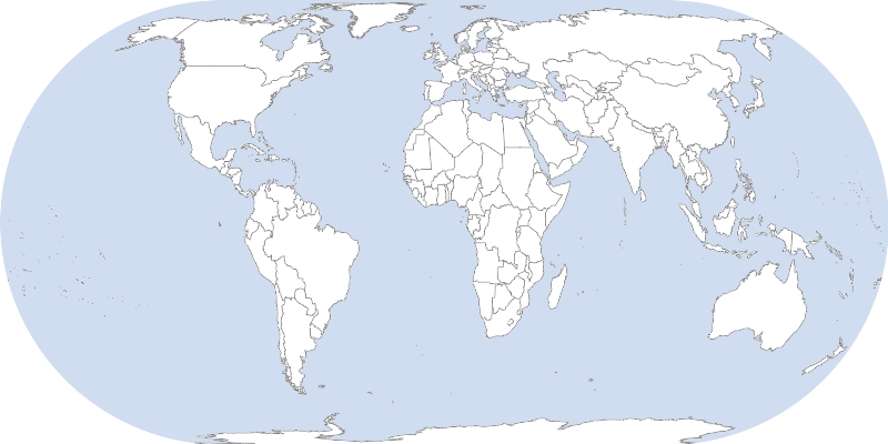
To get started I opened a world shapefile and computed the areas of all 3761 polygons (multiple polygons per countries). Filtering every polygon smaller than 10 square km would remove 434 polygons, or 11% of the polygons. I checked the names of the countries which the removed polygons belong to and found many island states among them (as expected). However, I think a hard cut at 10 sq km has some problems: One the one hand it removes some countries entirely (like the Maldives Islands) while still keeping many very many small islands (starting from 11sqkm). Click image to zoom.

Then I tried a different rule: remove all polygons smaller than 5% of the maximum polygon area of that country. Since the maximum area of the Maldives is 9sqkm, all islands are kept, while all small islands of the USA are removed. Also this halved the resulting SVG file size keeping the map correct in terms of includedness of countries.
However, removing every polygon smaller than 5% of the maximum per country is not satisfactory as well. Big and also well-known islands like Hawaii or Novaya Zemlya shouldn’t be removed in my opinion. Finally I came up with a combination of both rules: remove every polygon smaller than the minimum of x square km and 5% of the maximum area per country. This removes the small and unimportant islands but keeps the tiny island states.

Being very happy with this solution I looked at the Maldives islands for the first time (those black little dots on the left). Obviously, the islands seem to be way too small to be rendered in a meaningful way. This leads to this important question: Does the map need to include all countries or is it acceptable to ignore some countries, like the Maldives Islands? In the old map widget this wasn’t important because there was no country level view.
One projection for all countries?
A few thoughts regarding the projection that’s going to be used for the country-level views. I would like to simplify the whole thing by using the same projection for every country, but with different parameters (namely the projection center). One of the simpler projections is the orthographic projection, which looks the same as if looking onto a 3D globe. This gives quite good and less-distorted views for almost every country. The only country that looks quite distorted is Russia.
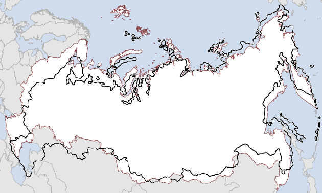
My opinion is that this distortion is acceptable given the simplicity of rendering maps in a single projection. In an ideal mapping world, however, one would use specialized projection for every country, like the New Zealand Map Grid for New Zealand etc.
Fixed vs. dynamic aspect ratio
The next design decision has to do with the aspect ratio of the maps. At some point in the map generation process I need to crop the country-level maps to a bounding box. The idea is to fit the countries as big as possible into the views while also showing a bit of their neighbour countries for navigation. Now the question arises to which aspect ratio the maps should be cropped. As far as I see do we have to options:
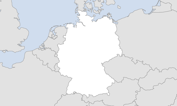
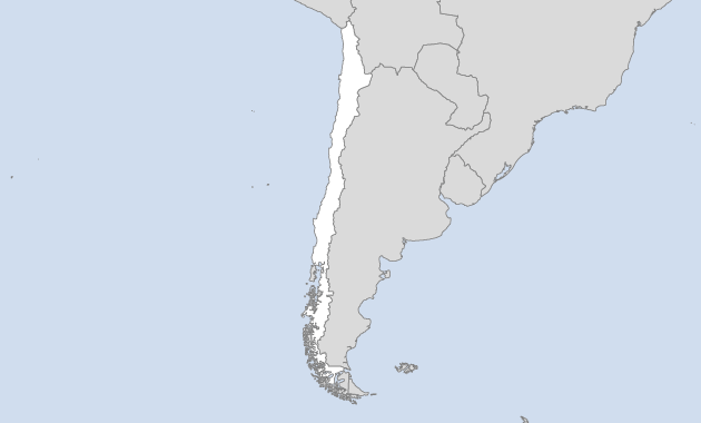
- A fixed aspect ratio (presumably some wide-screenish format) would be the simplest solution. The complete cropping could be done in the preprocessing stage, which would reduce complexity of map rendering. However, the obvious drawback of this solution is that the maps won’t look as good as they could when displaying countries in the “opposite” aspect ratio. For some portrait countries (like Germany), this should be acceptable. For other, more extreme aspect ratios (my favourite example is Chile) don’t.
- In the latter cases, a dynamic aspect ratio would make much more sense. It would be perfect if we could present the Chilean Piwik users (I assume there are some) with a portrait view of their country. Dynamic aspect ratios could be done either by choosing a fixed ratio per country or by cropping the maps at rendering time. Choosing a fixed ratio per country has the drawback that those countries could not fit a landscape ratio in fullscreen mode. In contrast, cropping at runtime may take more CPU. Also, I don’t know if the current dashboard supports dynamic resizing of widgets, but this may be easy to implement.
Comments
JulienM (Oct 30, 2011)
I really enjoy this thread, it reads like a good story. I’m learning a lot from it.