Visualizing the Global Digital Divide By Mapping Internet And Population
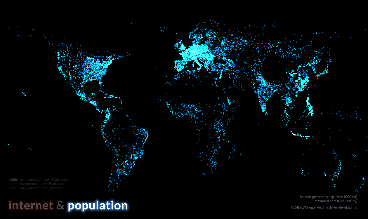
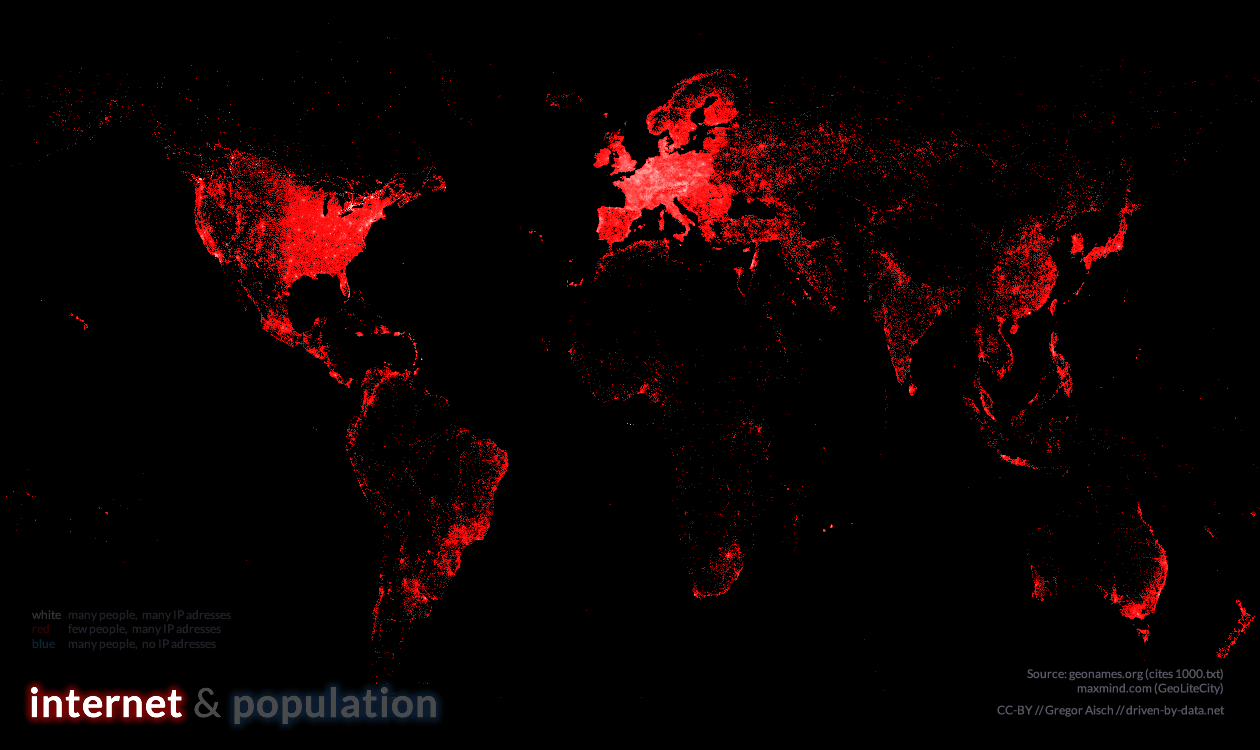
With this map I tried to visualize the global digital divide. It shows more than 80,000 populated places in blue and about 350,000 locations of IP addresses in red. White dots indicate places where many people live and many IP addresses are available. 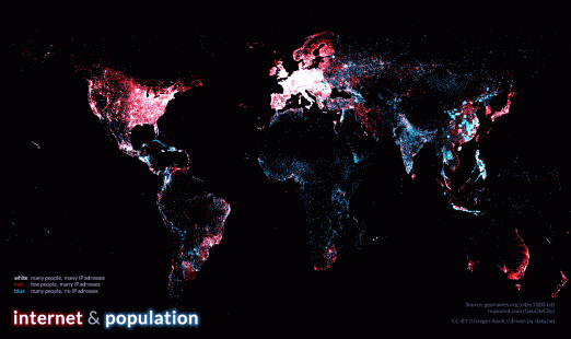 The IP address locations are taken from the GeoLiteCity database by MaxMind. The database of populated places is taken from geonames.org. The visual style is largely inspired by Eric Fischer’s wonderful Flickr-vs-Twitter maps. Also, here you can find a high resolution version and the separate layers for population and internet addresses.
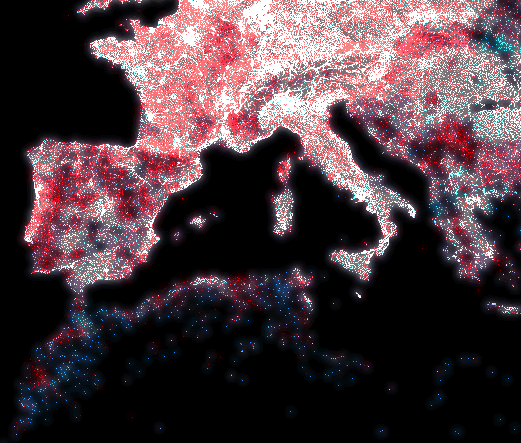
Comments
Puya (Dec 07, 2011)
Great Job!
An even more interesting map would be one showing internet connection density. IP-adresses divided by population.
Best, P.
Pete (Dec 07, 2011)
I dont understand the coloring - do you mean white dots are where blue and red dots overlap?
Armin Stroß-Radschinski (May 25, 2012)
simple and emotional touching (dangerous!) ;-) there is an ancient technique using needle pin holes in black cardboard and coloured paper behind, that created this beautiful effect. Carefully choosen colours & parameters can lead to intuitive understanding instead of just impressing… very important is the featured use of animation of parameters or sources over time. In this case, take care to take the same effort to display a legend that connects the displayed image to the configuration setting / base data behind. This is a nice example (using the same glow for the typography). Animating the glow of the data “points” can be a nice feature to focus certain areas or distributions.
A Mitchell (Dec 07, 2011)
100% dependency on the use of color to transmit essential information makes this map absolutely unreadable by the 10% of American men with some form of colorblindness.
Gregor Aisch (Dec 07, 2011)
Fortunately, most of those people with “some form of colorblindness” are Dichromats, which basically means that they still can read colors as long it’s not green. I checked this map using colorblindness simulations and found that it’s possible to distinguish colors. If you had trouble reading the map yourself, it would be helpful if you name your kind of colorblindness and describe what you see. Thanks.
Simon Morris (Dec 07, 2011)
Wow, great job.
The Hi-Res version might just find a place on my office wall :-)
cnawan (Dec 07, 2011)
Great, now add global cellphone penetration (5 billion). For extra points include CD-ROMs carried by donkeys into deepest Mongolia.
Cory Doctorow of Boingboing.net reckons the internet reaches basically everywhere, just some areas are really slow.
Osvaldo Nestor Bercovich (May 02, 2012)
congratulations, the world in your eyes is nearly for all, Thanks
sven (Apr 21, 2012)
i can’ say anythin coz it is amazing map vis.
great job dear.
A desigualdade de acesso à internet | Vislumbres sobre Visualidade (Jan 11, 2012)
[…] Você confere a página do projeto aqui. […]
David Mitzman (Jun 25, 2012)
I agree with Pete - there’s something puzzling about the colors. Maybe it’s your undefined term “many”. Are the red areas filled with IP addresses and low in population? (I wonder who uses the IPs) Is the color a ratio of IPs to population?
sam (Oct 15, 2012)
Good stuff What tools to visualize it?