Seven Features You'll Want In Your Next Charting Tool
This is a transcript of my lightning talk at NICAR 2015 yesterday. Please give the animated GIFs some time to load :)
Charting tools are great. They let us create charts and visualizations without writing code, and in a fraction of the time it would take to do in tools like Adobe Illustrator. Two years ago I helped building an open source charting tool called Datawrapper and when I got hired by The New York Times last year, the first assignment I was given was to build yet another charting tool which would be used by reporters and editors of our soon-to-be-launched site TheUpshot.
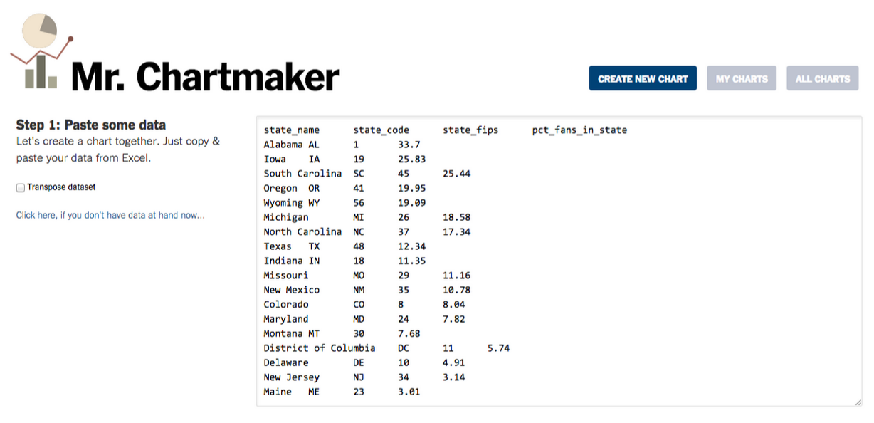
So, I created “Mr. Chartmaker”1. Naturally, I decided to start over from scratch, which is always more fun than messing with code you wrote like two years ago. Also this allowed me to add some cool features I always wanted to have in Datawrapper.
Inline text editing
Like inline text editing. In most charting tools, if you want to edit the labels shown in a chart, you have to go back one step and edit the data table, and you visualize them again and so forth, which kind of sucks. In Chartmaker you can simply edit all texts exactly where you see them in the chart, which makes the editing much easier. 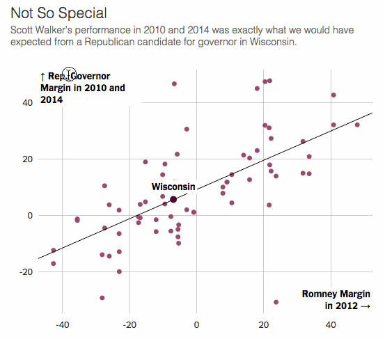
Direct selection of data points
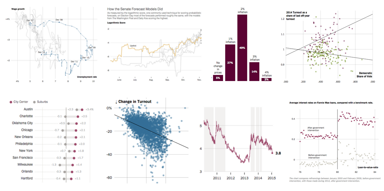
In scatterplots like this often it would be nice to highlight some additional data points, but the problem is you don’t really know which ones you want until you see them all plotted. So in our charting tool you can simply click on points in scatterplots or lines in line charts, and they get labeled. 
Free text annotations
Sometimes, to explain a chart to your readers, writing title and an intro sentence isn’t enough. So with our free annotation tool editors can just add text anywhere. This helps guiding readers through the chart and tell them what exactly to pay attention to. 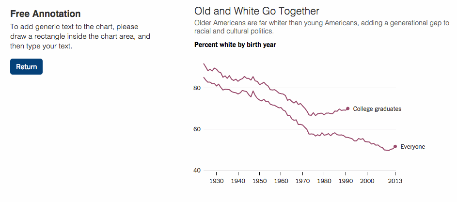
Adapting charts for different viewports
Now, with all this custom annotations, it gets harder to automatically resize the chart to fit in different viewports. So we added a feature that allows adapting charts for different sizes. It works like this: while editing, you can switch between different sizes of your chart and your edits are only applied to the selected size. For instance, you can use the short year format on mobile, or abbreviate state names that fit nicely in the full version but aren’t fitting on a phone. 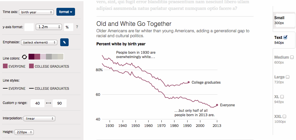
Newsroom integration
One of the great advantages of building your own internal charting tool is that you can integrate it into your newsroom infrastructure and workflows. For instance, Chartmaker lets us publish charts directly to our CMS, reducing the time wasted clicking through the same dialogs again and again. 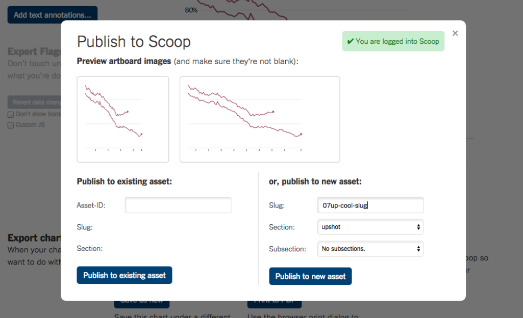 Of course, we also have a Chartmaker slack bot, which posts notifications whenever someone publishes a new chart.
Multi-user awareness and chart versioning
Which reminds me of the fact that a newsroom is a multi-user environment, and your charting tool should respect that. It happens that multiple editors are working on the same charts at the same time so chartmaker shows a gentle warning whenever you’re not the only one working on a chart. Also we keep all versions of charts so we can restore changes that got overwritten by accident. 
Expert custom javascript mode
Now, while it makes a lot of sense to re-use generic chart templates, sometimes there are chart forms you would love to do, but your charting tool just doesn’t support them out of the box. Like this “shifting arrows chart” we ran last year: 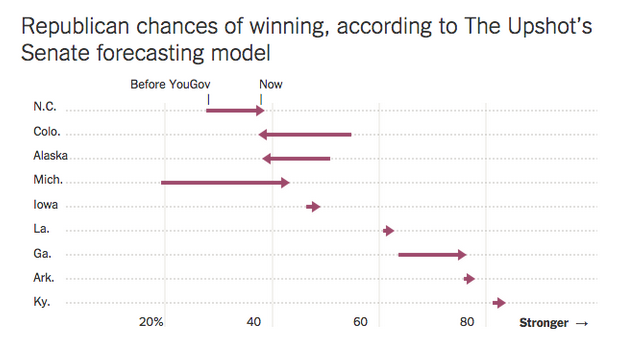 And — even though I said earlier that charting tools are great because they’re made to be used without programming skills, they sometimes are also being used by journalists who can write some code (if they must). So we2 came up with the idea of an expert mode where you can just add some final touches to a chart by writing a few lines of code.
 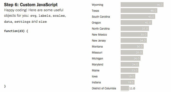 By the way, this is also a great way to learn code for some of our reporters. I hope you enjoyed me showing off these features, and maybe I inspired some of you for their work on similar tools.
Appendix: When will Chartmaker be released for everyone?
I knew that this question would come, but unfortunately I don’t have an answer at this point. But I will say this: “open sourcing” a charting tool is actually a lot of work, which I know because I already did so once. Chartmaker is built to work with our CMS, and our Timesian charting styles are pretty-much hard-wired into the tool. But there are already a bunch of open-source charting tools available that are good starting points for hacking away your own tool. Some newsrooms are using Quartz Chartbuilder, which isn’t terribly far away from Chartmaker. I’d also like to recommend RAW, which inspired the design of Chartmaker a great deal. And then there’s also my old love Datawrapper, without which Chartmaker wouldn’t be possible at all (huge credits go to Mirko Lorenz and Nicolas Kayser-Bril). And remember, Datawrapper is open source too, so you can go ahead and install it on your server right now. It has a Wordpress-like plugin architecture that makes it easy to add new features and to integrate it with your newsroom. Finally, I’d like to point to the open source release of ai2html, the Illustrator script that is the very heart of our print-to-web workflow at NYT graphics. This is actually pretty huge!
Comments
luv (Apr 13, 2015)
Hello mates, good article and good arguments commented here, I am truly enjoying by these.
Joshua watson (Apr 25, 2015)
Very much helpful.
- the name is a reference to Shan Carter’s Mr. Data Converter, and Shan explained the origin of that name here↩
- And by “we” I mostly mean Amanda Cox↩