Why we used jittery gauges in our live election forecast
 There has been some debate about the jittery gauge chart we used in our live election forecast. Rather than replying to dozens of tweets I decided to wrap this up in an old-fashioned blog post™. Feel free to add your thoughts to the comments.
@tsiro: straight up: the NYT needle jitter is irresponsible design at best and unethical design at worst and you should stop looking at it (Nov 9, 2016)
Why did we let the gauge needles jitter?
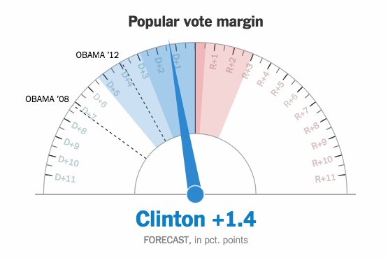
We added movement in our gauges for two reasons. First, we wanted to convey the reality that our forecast was “live” – connected to a live data feed and updating continuously, without any need for a user to refresh his or her browser. Movement helps convey that reality. This technique is common across the web, whether it’s on a site like chartbeat or a live gamecast of a baseball game. A “live” web page where nothing moves feels quite dead to the user. Second, we thought (and still think!) this movement actually helped demonstrate the uncertainty around our forecast, conveying the relative precision of our estimates. In our opinion, having the dial fluctuate a small amount – bound by the 25th and 75 percentile of simulated outcomes – was more successful at conveying the uncertainty around our forecast than simply listing what those percentiles were. As the night went on, the gauges fluctuated less and less as our forecast became more precise. By the end of the night, the gauges barely moved.
Why didn’t you just show the chance of winning?
The chance of winning is an important indicator that includes the uncertainty of the forecast. So why was that not enough? Well, the problem is that most people aren’t very good at interpreting a probability scale. While it is relatively easy to understand that a 50:50 chance is pretty high, and that a one in a million chance is pretty low, it is very hard to make sense of probabilities in between. How good is a 75% chance of winning? How much better is 85%? So rather than displaying just the chance of winning we wanted to show likely outcomes both in vote margin and electoral votes.
Why didn’t you just display the median outcome?
Because we thought that most people would read the median outcome as the one most likely outcome, as opposed to one of many very likely outcomes. Seeing the needle actually walk to the lower and higher end of the projected range makes us aware that these are real possibilities. Was it really just random jitter? The jittering was random, but the jitter range was not. The range was fixed between the 25th and 75th percentile of the simulated outcomes. Early in the night, the uncertainty was higher and the ranges wider. Towards the end of the night they got more narrow. The range was displayed as pie chart slice on the gauge, along with the 5-95th range.
Why did the needle movements look almost real?
To make the movements of the needle look more real we used Perlin noise, an algorithm that originates in computer graphics to simulate natural textures like clouds. We used the implementation from processing.js.
Why was the jittering stressing out a lot of people?
Part of the answer is that we simply don’t feel comfortable being left in uncertainty about something as important as this election. We like to feel safe and cozy, being told our favorite candidate has a “narrow but persistent” lead, but we don’t like being confronted with likely scenarios in which the candidate might actually lose. Of course, the bigger reason for the stress was probably the outcome of the election itself.
Update: here’s another take on this subject by Andy Kirk
Comments
David (Nov 14, 2016)
Another question, seriously posed: I totally understand why you added the jitter. Did you anticipate it making people nervous, and now that you know how people felt, would you do it that way again?
Gregor (Nov 14, 2016)
Yes, absolutely. Next time we’ll put the gauges on any forecast and polling average display we publish.
Alper (Nov 14, 2016)
I liked the implementation of animation to communicate model uncertainty, but I felt like it needed some explicit, static annotation of what it was doing. The absense of this information may have led to viewer stress :)
Something like showing a “density field” that shows the probability field under the needle — communicates both the range of variance and the likelihood of the needle landing on a particular position.
hrbrmstr (Nov 14, 2016)
+100 both for the design and the willingness to help convey uncertainty to a general audience. I wish that interpreting and being comfortable with uncertainty was taught as a fundamental skill in school. Oddly enough, folks have no issue with rounding (which inherently introduces uncertainty to a fixed number) but tend to reject the lack of precision when statistics like this are presented.
Nick (Nov 15, 2016)
Are you going to use the jitter animations again?
-stephen (Nov 15, 2016)
It goes well with Fox News’s shakey-cam - they use it on every show with standing mods and TV displays. Makes me nauseous.
Marc Lajoie (Nov 15, 2016)
It made people nervous because it implied a TREND where none existed. They would see their preferred candidate’s chances rising and falling, but the situation actually hadn’t changed at all! Oh no, my candidate is on a downward trajectory! (But not really.) Especially early, when the swings were wild.
I was on a ferry on my way to work, biting my nails like the rest, then my boat passed through the part of my route that has no cell signal. And the needle was still moving! This was absolutely irresponsible. The whole thing could have been fixed with an editor’s note explaining what was going on, btw.
Gregor (Nov 17, 2016)
I agree on the annotation. That’s something we just forgot to add..
Francisco Guerrero (Nov 17, 2016)
Oh man! your plots were really inspiring. They are like dynamic story arcs: you can see how uncertainty raises, reaches a max, and declines. Actually, this behavior can be described according to the principles of Shannon’s information theory (the mathematics of uncertainty). Changes in uncertainty in natural systems following the same pattern have been documented in molecular biology, stream ecology, and palaeoecology. Now, we can add another example to that growing list: human politics. Thanks.
Robert Monfera (Nov 18, 2016)
No need to be defensive - the jitter, or other means of sampling from a probability distribution visually is great precisely because it causes an emotional response. If probabilities are conveyed properly, then the uncertainty registers with the reader and becomes visceral, which can lead to anxiety. Avoiding this effect would either operate on a false sense of certainty (untruthful) or lagging behind the events (untimely). Embrace and highlight, rather than shield readers from uncertainty.
Axel (Nov 21, 2016)
Did you consider keeping the number below the gauge static? I understand and agree with the arguments for the jitter effect on the needle, but to me the fact that it was applied to the number as well made the whole component and the probability data it conveyed feel unreliable.