In Defense of Interactive Graphics
No, interactive graphics are not dead. It is also not true that “85% of the Times‘ page visitors online simply ignore interactive infographics altogether”. But since I sort of helped create1 this confusion, I think it’s time to set this straight:
Interactive graphics are still great, and there are a lot of good reasons to make them!
Knowing that the majority of readers don’t click buttons does not mean you shouldn’t use any buttons. Knowing that many many people will ignore your tooltips doesn’t mean you shouldn’t use any tooltips. All it means is that you should not hide important content behind interactions. If some information is crucial, don’t make the user click or hover to see it (unless you really want to). But not everything is crucial and 15% of readers aren’t nobody. So there is a lot we can do with interaction, and I am going to point out three examples below.
1. Tooltips allow your most interested users to dig deep
Take a look at the following graphic which summarizes election results across 20 European countries. Everything you need to see is shown right away. You see the country names, the years and the red bars representing the results of right-wing and far-right parties.
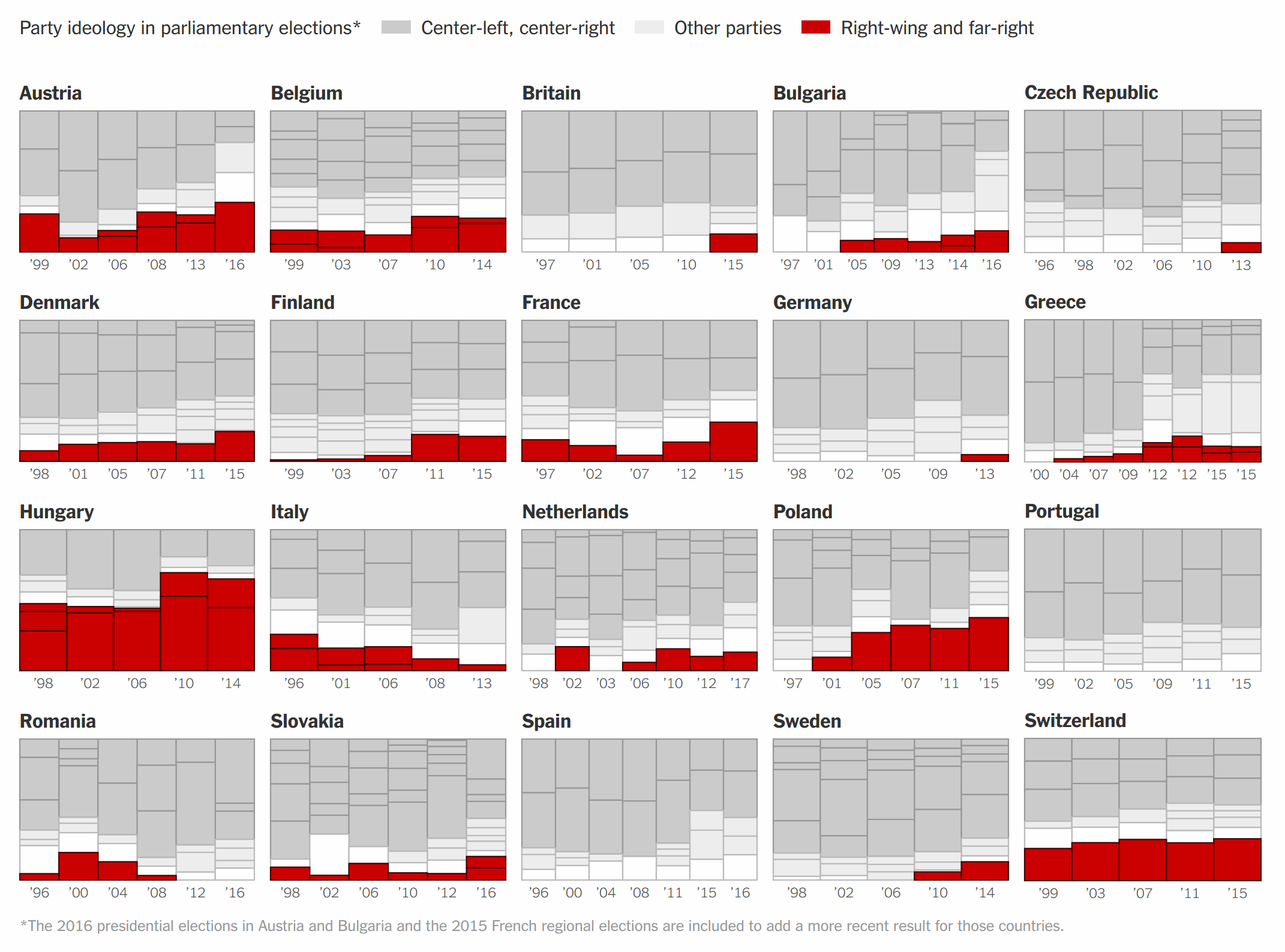
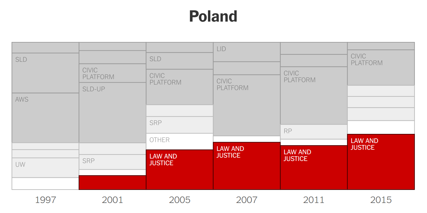
Further down on the page, we showed larger versions of the charts for a few countries which are more relevant because they either held elections recently or going to hold elections soon. In those charts, we label the parties, because they are important and thus should not be hidden behind tooltips.
Now we could have just published this graphic as it is and nothing would be wrong with it. But we decided to add tooltips revealing the party names and vote percentages.
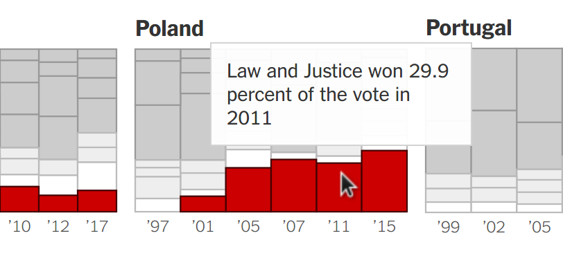
So did people use the tooltips? Oh, yes they did. Our most passionate readers from many different countries went deep into the numbers and fact-checked the party affiliations and election results, leading to a sad record number of corrections we had to add after the first publication. It’s safe to say that none of the errors would have been spotted without the tooltips, and I am happy we were able to correct them.
2. Interaction allows readers to discover the full dataset
There are cases when you have far more data than fits on a page, which means you have to select which charts to show and which to hide. To avoid cherry-picking we usually try to come up with a selection rule that we apply consistently throughout the piece. For instance, in a recent graphic we decided to show the first poll after the start of the term for each president. Deciding on such a rule is better than just picking charts, but it can still feel arbitrary sometimes. Fortunately, we had already set up the graphic in a way that the charts are rendered dynamically. So it didn’t cost us much to add in a little bonus feature that allows browsing through the entire dataset.
We didn’t expect that a lot of readers would use the navigation. In fact, readers even had to stumble across the gray arrows which were hidden by default so they wouldn’t distract from the linear reading flow2. Again, the static version of the piece is great on its own, so missing out on the interaction doesn’t do any harm.
3. Interaction can help build trust in your data analysis
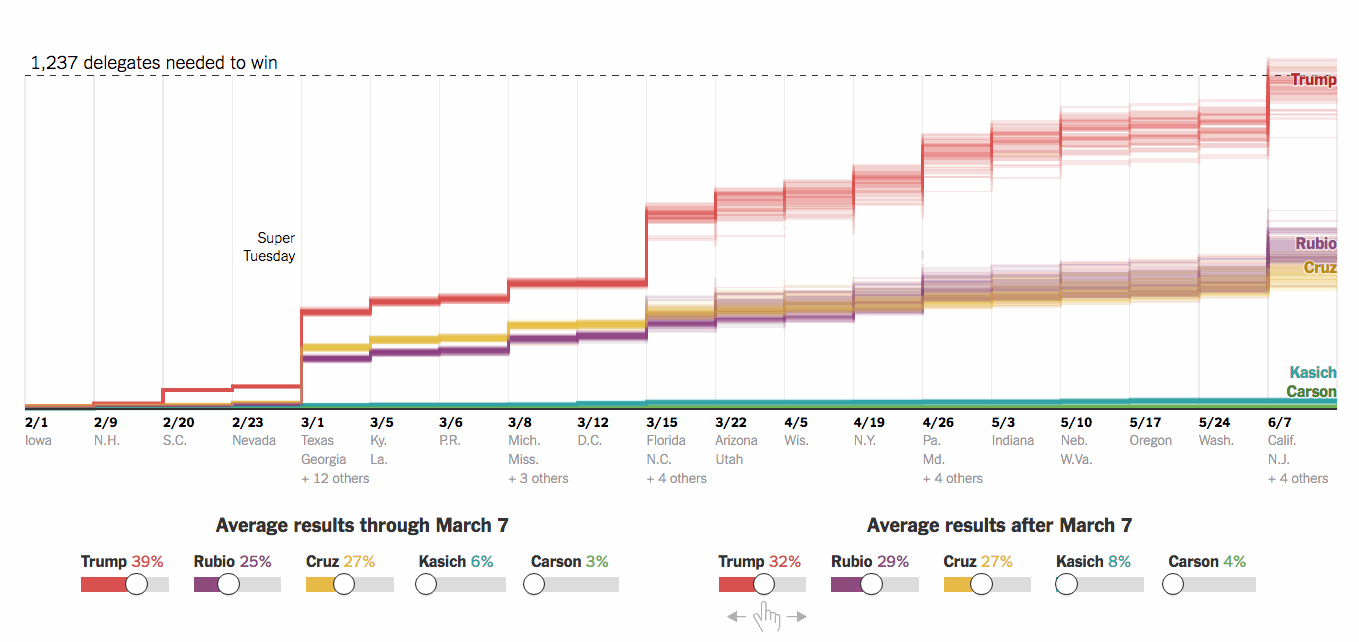
Early in 2016, there was still a field of five contenders in the Republican primaries. While Donald Trump had a slight advantage many political analysts remained skeptical about his chances of eventually securing enough delegates to become the nominee. So we decided to build a delegate calculator.
Given a baseline estimate of average results per candidate, the calculator simulated 100 random outcomes of the primaries. It took into account the exact rules for allocating delegates, which varied state by state from simple winner-takes-all to proportional allocation to a lot more complicated rules.
The somewhat surprising result at the time was that Trump actually wouldn’t need crazy margins of victory to stay on track for the nomination. Of course we didn’t want to appear as if we knew the outcome of the primaries, so we decided to show a couple of mathematically possible scenarios. In one scenario Trump won, in another it was Rubio etc. And at the end of the piece, we invited our readers to make up their own scenarios.
Adjust the sliders in the chart below to explore more scenarios. The scenarios presented here do not aim to predict what will happen, because we don’t know what will. But they are theoretically and mathematically possible, and thus help us understand the dynamics of the race to the Republican nomination.
Interaction → transparency → trust
So, concluding this post, I hope it became clear that there are still a lot of good reasons for making graphics interactive, even if only a small share of the audience will dig into it.
Tooltips make the presented data more accessible and invite readers to fact-check your numbers. Subtle navigation buttons can provide access to hundreds of interesting charts you otherwise would have to cut out of a piece. Sliders can invite readers to test your simulation code and try out their own scenarios.
And if interactive graphics are not just a fun addition but can actually increase the transparency of our work, open us for criticism, and thereby, hopefully, help rebuild some trust in journalism, I think they’re worth it.
- The number comes from me measuring the percent of readers who clicked on a prominent button in a couple of graphics we published in 2015. I mentioned the number in a conference talk, from where it ended up in another talk, then on Medium and finally on FastCo.Design. However, the 85% of readers didn’t ignore the graphic, they just didn’t click the button.↩
- I later changed the behavior so that the arrows show up permanently as soon as you scroll down far enough into the graphic↩