How To Avoid Equidistant HSV Colors
As some of you pointed out in the comments of my last post, taking equidistant colors in the HSV color space is no solution for finding a set of colors that are perceived as equidistant. This post describes what’s wrong with HSV and what we can do about this. Note that since this post contains interactive elements built on the latest web technologies, you might need a modern browser to get the most out of it.
What’s so wrong with HSV?
Well, the main problem is that the value component of HSV is just a measure for the physical lightness of color, but not for the perceived brightness. Thus, fully saturated yellow has the same “value” as blue. The same is true for the HSL color space. Here is a set of six colors of the same value to demonstrate this effect. The second row shows how the colors look after converting to grayscale via Photoshop.


Beside of this strong hue-dependency of brightness, there is also no linear brightness gradient within a single hue. For instance, in the following HSL color scale the brightness step between the second and the third red appears much bigger than the step between the 3th and 4th color. Even worse, this effect seems to differ across different hues, as the comparison to the blue scale shows.


After all, this should be enough reason to avoid equidistant HSV/HSL scales. But what options do we have instead?
For the lazy ones: Use ColorBrewer
So the question is, what shall we do about it? In the comments someone mentioned ColorBrewer, which is in fact a great solution for those who just want to get some colors without caring too much about the details. Here’s a selection of sequential ColorBrewer scales.
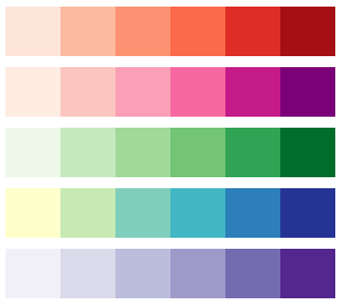
One drawback of this solution is that you’re limited to a fixed number of colors. For each color scale, the collection gives you variants from 3 to 9 colors. Another drawback is that sticking to a predefined set of colors means giving away some artistic freedom. Also, and most importantly, it’s not half as fun to pick existing solutions, isn’t it?
For the color geeks: Make friends with CIE Lab*
At this point, you better prepare yourself for some ultimate color geekyness. Thanks to the gentle introduction of David Dalrymple, I finally dared to enter the magic world of the CIE Lab* color space. To get a better understanding of this color model, I ported David’s code to JavaScript and built a tiny Lab color selector. The vertical slider allows you to navigate through the space. Also you can change the x and y axis using the links next to the slider. In general, the Lab color space has one component for Lightness and two bipolar color components a (yellow-blue) and b (green-magenta). While the lightness ranges from 0% to 100%, determining the valid ranges for a and b is somewhat tricky. The problem is that CIE Lab* contains more colors than are available in RGB. For instance, the “valid” range for a depends on the lightness and the second color channel. Another problem is that it’s hard to select colors by mixing four colors. To get around those issues, David Dalrymple suggests a fancy transformation of the Lab space.
HCL: Making CIE Lab more accessible
The trick is easy. You use the a and b components to compute a color angle (hue) and a radius (chroma). Because it’s not exactly the same as saturation in HSV, it’s named c (for chroma). Basically this gives this us the CSL color space (although I’m not sure how this is named in vis science).
Update: Thanks to Kelsey Higham I now know that the color space is actually named Hue-Chroma-Lightness or Munsell color system. As Maureen Stone correctly noticed in the comments, HCL is in fact just a cylindrical transformation of CIE Lab*. The L component also has some similarities to the Munsell color system. While the problem of non-existent colors still remains (especially if you increase saturation) this looks like something we can start to work with.
For instance, if we take a look at equidistant HCL colors of the same lightness we get a much better result. Actually, if you’d convert this into grayscale again you get the exact gray value for all colors. Well, this is no big surprise, I bet Photoshop itself uses CIE Lab* for grayscale conversions.

Now, let’s grab some colors..
This is where the fun begins, so I’m glad you made it up to here. To learn more about the difference of equidistant colors across color spaces, I visualized the linear gradient in the color selector. Feel free to experiment with them and check how the HCL color space compares to other spaces like LAB, HSV, HSL or RGB. Also, it’s interesting to directly compare the interpolated colors across different color spaces:
Nice! How do I get those colors?
To make things easy, I packed everything up in a small JavaScript library named chroma.js. It has a simple yet powerful API, check out the Github repository to learn more. Since this is still in early beta phase, I’d appreciate if you document bugs you may encounter.
// most simple interpolation in HCL space
chroma.interpolate('#383D41', '#EFEE69', 0.5, 'hcl').hex();
// returns "#5C9A7C"

// also, you can instantiate HCL colors directly
chroma.hcl(60, 0.7, 1).hex();
// returns "#C6A860"
Update: Isn’t there an easier way?
Yes! Now there’s two new web-based tools that allow you to create nice color scales using Chroma.js.

The first one, titled Colors for data scientists and created by Mathieu Jacomy, provides advanced tools to generate, correct, and complete color palettes. Mathieu also wrote a lot of additional explanation why it is better to use the Lab* color space for automated color palette generation.

The second tool is more targeted to people who simply want to quickly pick some nice colors from the HCL color space. It is based on the color picker shown in this post, but allows you to copy the hex codes for the colors. Also it shows you a choropleth preview of the colors which gives it this special Colorbrewer feeling, and you can bookmark and share you color palettes, too. It was created by Tristen Brown.
Update 2: Using HCL in d3.js
Now there’s also a plugin that makes it easy to use HCL (or CIE LCh, how Mike calls it) within the powerful d3.js visualization library. You can see it in action here. To make it more clear how to use the HCL interpolator, I created this simple example snippet (live demo here):
var data = [0, 1, 2, 3, 4, 5, 6, 7, 8, 9, 10];

var color = d3.scale
	.linear()
	.domain([0, 10]) // min/max of data
	.range(['#FDFFCB', '#232942'])
	.interpolate(d3.cie.interpolateLch);

d3.select('body')
	.selectAll('div')
	.data(data)
	.enter()
	.append('div')
	.style('background', function (d) {
		return color(d);
	});
Comments
The rainbow is dead…long live the rainbow! – Part 2: a rainbow puzzle « (May 29, 2012)
[…] How to avoid equidistant HSV colors […]
Enrico Bertini (Dec 13, 2011)
I’ve been waiting for such a thing for ages, but realized that only after reading it. Thanks a lot, this is super-useful and I am looking forward to sharing it with my research group here in Konstanz. We are quite serious about color scales and we have a number of tools you might like:
David Dalrymple (Dec 13, 2011)
This is awesome! Thanks so much for building upon my work. :)
Aubrey Pullman (Dec 16, 2011)
Please be aware that some color to gray conversions in Photoshop use unequal channel mixing, so the values will be different.
Thank you for introducing me to the CSL colorspace!
Time to spice up your visualization skills? « (May 25, 2012)
[…] How to avoid equidistant HSV colors […]
matteo (May 25, 2012)
After leaving my comment yesterday I remembered reading this paper on Harmonic Colormaps for Volume Visualization. In addition to be very interesting from color science, and design perspective, it shows how one could interpolate from one hue to the other in HSV, and how to derive equi-lightness color scales for volume rendering (see in particular Fig. 3 and Fig. 8). Thanks again for the great post. http://www.cs.sunysb.edu/~mueller/papers/vg08_final.pdf
matteo (May 25, 2012)
This is a great post. I really like how you explained the non unique brightness gradient from hue to hue and also within two steps in the same hue. And the tool is both instructive and practical. Thank you! If you are into Matlab I recently posted on my blog a sample code that can be used to assess the perceptual ordering/effectiveness of any existing color palette using the lightness Lfrom CIE Lab space. http://mycarta.wordpress.com/2012/05/12/the-rainbow-is-dead-long-live-the-rainbow-part-1/
I will also shortly post some experiments I have done to quantify (using intensity) how bad the 7 colors in ROYGBIV are, and how they look like for a person with color vision deficiency. it should be up by the weekend.
(Jun 01, 2012)
The rainbow is dead…long live the rainbow! – Part 1...Introduction This is the first post in a series on the rainbow and similar color palettes. My goal is to demonstrate it is not a good idea to use these palettes to display scientific data, and then answer these two questions: (1) is there anything we …
Rick (Dec 17, 2011)
Great post and explanation!
The interpolated colour comparison in particular is a fantastic example that I’ll be pointing students to on a regular basis.
CSL Colors in Chroma.js — vis4.net/labs (Dec 17, 2011)
[…] Colors in Chroma.js For my blog post “How To Avoid Equidistant HSV Colors” I created an interactive color space explorer, also known as “color selector”. […]
Jon von Gillern (May 23, 2012)
There is an alternative color space called YIQ that deals with perceived luminescence. I wrote a small function that can tell you given an arbitrary background color, whether white or black text would be most readable. You can checkt it out here: http://blog.nitriq.com/BlackVsWhiteText.aspx
The rainbow is dead…long live the rainbow! – Part 1 « (May 12, 2012)
[…] How to avoid equidistant HSV colors […]
Maureen Stone (Jul 11, 2012)
It’s really great to see more perceptually ordered color spaces being applied to visualization. But, there’s some misinformation/oversimplification flying about.
To be accurate, CIELAB should precisely encode your display colors and settings (calibration). The CIELAB implementation being used assumes an sRGB calibration. A good starting point, but tools like Photoshop allow the user to be more specific about their display parameters (in the Color Settings dialog). So, I’ll lobby for that enhancement to the CIELAB implementation. And I’ll definitely lobby for more complete information about the approximation in this implementation.
Second point: HCL is not Munsell, which is a color ordering system based on colored samples that is available commercially here (munsell.com). L is a good match to Munsell Value, but the hue and chroma are less similar. HCL is just a cylindrical representation of the LAB Cartesian space.
Maureen Stone (Jul 11, 2012)
Gregor,
I agree, using CIELAB based on sRGB is a great approximation. I use it all the time. Mostly just lobbying for a note to that effect so people remain aware.
Expanding the implementation for customization would be nice also. Am trying to learn D3, maybe I should give it a try (smile)
One final suggestion from this old color geek is to change your L/A and L/B plots above so that L is on the Y axis and the A or B starts at 0. Will create a more typical view of CIELAB for a display.
Benjamin Golder (Jul 13, 2012)
Thank you so much for this post. I’ve been using it as a reference for data visualization, and I’m so happy to see it now extend into these other plugins.
Maxim (Jul 20, 2012)
Thanks for the post. I came across it while browsing something unrelated on this site, but I had recently been frustrated with HSL/HSV, So it was a nice surprise to find this post, which pointed me towards the solution to my problems.
A correction:
This is not a cylindrical transformation of Lab. It is conical, with the tip of the cone anchored in the black tip of the color solid. Adjusting “C” adjusts the spread of the cone.
This means that the “C” variable does not correspond to chroma. For example, when C is set to 1 in the “H/L” diagram, only the colors at the “bottom” have a chroma of 1. The colors in the middle have a chroma of .5, and the colors nearest to black have a very low chroma. In the “C/L” diagram, blue goes off the charts because it extends right past the narrow part of the cone, but yellow is greatly stunted, and it appears that there are as many “dark” yellows as “light”, when in fact there are substantially more light yellows. It is as if all the dark shades have been smeared far to the right. So the present function is not really H/C/L, but something like H/CL/L.
David Dalrymple’s formulas were meant to specify a 2-dimensional sheet that had no gaps, but are not needed in this context, since you have control of what the formula tries to keep static. I see that you added a “chroma” multiplier to his adjusted L (presumably to keep the formulas), but if you replaced L with C in that part of the code (var r = c;), you would have a correct cylindrical transformation that may rightly be called HCL.
The rainbow is dead…long live the rainbow! – Part 1 | Lukor.net (Jul 25, 2012)
[…] How to avoid equidistant HSV colors […]
David Dalrymple (Jul 11, 2012)
Maureen is correct - HCL is not the same thing as Munsell.
Gregor (Jul 11, 2012)
Hi Maureen,
First of all, thank you for your comment. I changed the comment about Munsell, accordingly.
You’re right, Chroma.js uses sRGB which is only an approximation. In an ideal world, you would know on what device the colors are displayed on (printer, monitor, etc) and how these devices are calibrated. However, in the world of casual, web-based visualization (which I work in), you cannot assume anything about where the colors will be shown. That’s why you have to approximate (at least unless there’s a web standard for transmitting more detailed properties and configuration of output devices).
Before Chroma.js, I felt that there was a clear line between technical color spaces like RGB/HSV/HSL and perceptual, device-calibrated color spaces like CIE. Everybody knew that there’s more research done on the color front but hardly anybody used it in actual projects. One reason for that was that the theory and formulas behind CIE are way more complicated than converting from RGB to HSV.
Having that said, you’re absolutely right about the oversimplification. But then, after all, HCL outputs some nice color scales which are less incorrect than HSV or HSL and easier to customize than ColorBrewer. That’s why I published Chroma.js and people like to use/fork it.
Resources for color / colour selection - brock craft (Aug 16, 2012)
[…] http://vis4.net/blog/posts/avoid-equidistant-hsv-colors/#more-3199 […]
Colour spaces | s-anand.net (Aug 27, 2012)
[…] I absolutely have to do things programmatically, I use the HCL colour scheme. The good part is it’s perceptually uniform. The bad part is: not every interpolation is a valid […]
Cristian (Sep 04, 2012)
The best paper on the subject is here: http://magnaview.nl/documents/MagnaView-M_Wijffelaars-Generating_color_palettes_using_intuitive_parameters.pdf (Wijffelaars M, Vliegen R, Van Wijk JJ et al. 2008)
Also is worth reading the following: Martin Krzywinski articles on tuple colors enconding http://mkweb.bcgsc.ca/tupleencode/ and the papers on perceptually-based color space
- Escaping RGBland: Selecting Colors for Statistical Graphics (Achim Zeileis, Kurt Hornik, Paul Murrell) http://statmath.wu.ac.at/~zeileis/papers/Zeileis+Hornik+Murrell-2009.pdf
- Color Space Considerations for Linear Image Filtering staff.fh-hagenberg.at/burger/publications/pdf/aapr2010.pdf
regards, Cristian.
The rainbow is dead…long live the rainbow! – Part 3 « MyCarta (Oct 06, 2012)
[…] How to avoid equidistant HSV colors […]
The rainbow is dead…long live the rainbow! – Part 4 – CIE Lab heated body « MyCarta (Oct 14, 2012)
[…] How to avoid equidistant HSV colors […]
The rainbow is dead…long live the rainbow! – Part 5 – CIE Lab linear L* rainbow « MyCarta (Dec 06, 2012)
[…] How to avoid equidistant HSV colors […]
Nigel Banks (Dec 13, 2012)
Brilliant - thankyou so much for putting this together - I’ve historically read quite a bit about colour (for describing colour transitions during ripening in fruits and vegetables) and set out boldly recently to tackle choosing a collection of 7 colours at even spacings around the colour wheel. In short, we became reasonably substantially mired and your article has neatly explained why. The bit I need to go back to and read more carefully is the solution as that sounds close to my historical home of using hue, chroma and lightness values, so in the end the solution should have been right under my nose all the time. Anyway, at my end some more careful reading and reflection to be done. At your end, THANKYOU! for putting these pointers / solutions together, cheers, N
Comparing color palettes | MyCarta (Dec 21, 2012)
[…] How to avoid equidistant HSV colors […]
The rainbow is dead…long live the rainbow! – Part 3 | MyCarta (Jan 03, 2013)
[…] How to avoid equidistant HSV colors […]
Ideas for Improving Your Scientific Visualizations : Exploring the Data Universe (Jan 05, 2013)
[…] create perceptual artifacts that obscure the very trends you’re trying to display. Perceptual colormaps are a better alternative. The ColorBrewer colormaps are the most well-known. Python’s […]
Martin (Jan 15, 2013)
Brilliant post, thanks for putting this together! Playing around with your color picker I’m just wondering: When in C/L Mode, shouldn’t the colors at the left edge of the canvas be neutral greys? Because Chroma is 0?
I tried using the picker to create custom diverging color palettes with a neutral grey as middle color. Any recommendations for this task?
Maxim (Jan 15, 2013)
Martin: The colors at the left edge are neutral greys. They have a warm hue due to Lab’s white point/standard illuminant. You will see that they don’t change hue as you adjust hue.
To create your diverging palette, put one end of the selector up against the left side in “CL”, and position the rest horizontally. This gives you a beam shooting out from the axis. Record the colors. Now rotate the shape by adding 180 to hue, and record the other side of your palette. See also my comment below for a note on this.